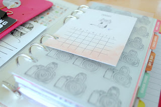
For January Challenge #3 at the Counterfeit Kit Challenge we are using repetitive stamping designs to create some interest in our designs (and, of course, to dust off some of those much neglected stamps!)
This month I've been busy using my Planning For Perfection Kit to personalise my Color Crush Planner and decided to add a customised dashboard to the front of my planner - as a way of reminding myself to take more photographs!
Adding a customised dashboard or divider is one of the simplest ways you can put your own stamp on a new planner (Oh my. Do you see what I did there? I am hysterical!) but it can be difficult to create a repeated design, even with a clear stamp, simply because it's difficult to keep the image well positioned.
Over time, I've tested some simple methods and have found one which works for me, even when I'm using block mounted stamps. My results are, of course, never perfect but I'm usually happy with them. And that's what counts, right?
You'll Need:
Acetate (transparency or clear dashboard)
Stazon Ink (or a similar, alcohol based ink)
Stamp(s)
Paper/Cardstock
Pencil
Ruler
Eraser
Single Hole Punch
Planner Clips
1. Choose a stamp set that looks awesome. Mine is the Selfie Stamp Set from Wilkinsons. (They outdid themselves on this cute stationary range. There are some really cute designs!)
2. Measure the mount block (not the stamped image) and, onto a clean sheet of paper, mark out the measurements. Ensure that the 'blocks' created fit within the lines.
3. Layer the acetate onto the paper sheet and ensure that it will not slide around whilst stamping, by adding a couple of clips to the sides, top or bottom.
4. Add ink to the stamp and stamp directly onto the acetate using the lines to position the stamp correctly. To ensure minimal smudging, right-handers should start in the top left-hand corner and work from left to right, moving downwards, to ensure minimal smudging. Left-handers may want to start in the top-right!
5. Leave the ink to air-dry for at least half an hour (to avoid smudging.) Once the ink is dry, remove the clips. You might need to fill in some blank spaces, if they were occupied by the clips!
6. Add holes to the acetate using a pre-punched divider/planner page as a template. Add to binder and then stand back and admire.
Extra Tips & Techniques -
1. To add stamped images to patterned papers and cardstocks (e.g. non-transparencies) draw the measured lines in very faintly with a pencil, then erase with a soft, smooth touch.
2. Repeated patterns look amazing with coloured inks, so try a mixed up look!
3. Practise stamping skills on transparency saved from old packaging before unleashing creativity on special projects.
4. You can re-use the measured lines with other stamps by choosing where to position them within the lines. (e.g. line up smaller stamps along the bottom-left lines.)
4. You can re-use the measured lines with other stamps by choosing where to position them within the lines. (e.g. line up smaller stamps along the bottom-left lines.)
I'm slowly, but surely, starting to work out how to customise my planner to suit my own needs and - each Saturday - will be sharing more ideas and tutorials. I hope you'll come back to visit! In the meantime, make sure that you visit the Counterfeit Kit Challenge, where Leslie and Margie are sharing thier own takes on the challenge!


Thanks for the tutorial Clair - your planner is really looking fabulous! I will definitely be back for the updates. I'm not really a planner person but seeing yours is really tempting me!
ReplyDeleteWhat a simple yet brilliant tutorial! I love how you have given us all the tips & tricks possible to avoid the common stamping issues. I am bookmarking this one :) And did I mention how appealing your transparency is? So many times I would love a little something to overlay onto a project - this was a great reminder of how easy that is to accomplish. I love the idea of multi-colored images, although my Stayzon stash is limited to black & brown at the moment.
ReplyDeleteVery neat result, and even in monochrome it looks very stylish. Looking forward to more inspiration :).
ReplyDeleteGreat tutorial and ideas for personalizing planners. Visted your blog via Planner Dreams on FB. Just double checked which group it was and realised we are both Rigby's!
ReplyDeletea regular series and lots of planner tips in the process - sounds great to me. What a great but simple explanation for how to stamp like this - thanks!
ReplyDeleteThis organized accounting type loves your grid idea. Making mental note. Fab post for this fab project.
ReplyDeleteGreat idea! I dove the cameras!
ReplyDelete